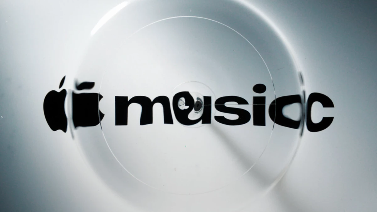

Apple Music built its new logo from vibrations in a dish of mineral oil.
Apple introduced a new identity for the platform, with a logo mnemonic, a custom audio signature, and visuals drawn from sound waves.
Bespoke agency TBWA\Media Arts Lab LA developed the work with producer Fred again.. and his collaborator NEST Acoustics.
Apple worked with the pair to translate music into physical movement that cameras could capture.
The brand's post on X credited the original composition with physically shaping the new visual identity.
Introducing a new identity for Apple Music, physically shaped by an original composition from @fredagainagain1 and NEST Acoustics. https://t.co/LFXLIfexPL
— Apple Music (@AppleMusic) October 21, 2026
In a video shared on YouTube, Apple said the whole identity comes from the idea of being "made by sound."
Apple plans to use the audio signature in its campaigns, original programming, live events, and product experiences.
The same cue can then greet listeners wherever they meet the brand.
The film arrives about a week after iOS 27.2 beta 4 swapped the red Music app icon for a black-and-white one.
Plenty of users trashed the new icon online, calling it dull and generic.
Apple's answer is a film showing that music itself made the new look.
The new black and white Apple Music icon on iOS 27.2 beta 4 is boring. Just bring back the iOS 10 icon. https://t.co/SetOGBhE0R
— Iorel (@Iorel_X) October 13, 2026
It ran the same formula last year, pairing an in-camera glass logo for Apple TV with a sonic logo from Optical Arts, Finneas, and its bespoke agency.
Apple Music now gets the same treatment, after MIDiA Research puts its share of global music subscribers at 12.6%.
The brand strategy now rests on a sound that listeners can link to Apple Music before they check a screen.
Single Notes Draw the New Note Icon
The team broke the music down to single notes and fed chosen frequencies into a transducer sitting in a thin layer of mineral oil.
The transducer moves in step with the audio it receives, so each note disturbs the oil in its own way.
The crew captured every pattern of ripples and bending light on camera.
Instead of drawing music, the team recorded what music does to a liquid, and this footage became the raws for the logo and the surrounding visuals.
Apple says getting there took months of testing with its collaborators.
The visual identity also borrows from "Liquid Glass," the translucent design language that Apple rolled out across its software last year.
The wordmark now sits beside the Apple symbol in a heavy, lowercase custom version of SF Pro.
A new musical note icon extends the captured motion across the wider identity.
Apple also released a film that walks through the process, starting with the original composition and ending with the finished mnemonic.
Apple Music will start applying the identity to its original content and event programming this week.
The wordmark first appeared last month in the promotion for Apple Music Hall, the platform’s new live music venue in London.
Further updates are expected with iOS 27.2 and macOS 27.2.
Brands retiring a familiar color can soften the blow by showing the craft behind the brand refresh.
YouTube Music Closes the Subscriber Gap
Apple Music is rebranding in a category where it has been losing ground.
It held 18.4% of global music subscribers at the end of 2020, so it has lost nearly a third of its share in five years.
MIDiA Research says that YouTube Music is on track to overtake Apple Music in global subscribers before 2026 ends.
Sound can help in this fight. Veritonic research found that 77% of consumers recall a brand more easily when they link it with a particular sound.
Apple's rollout offers a few moves that any brand planning a sonic identity can copy:
- Give the identity a story the audience can watch: Footage of how a mark got made gives people something to share and a reason to accept a redesign they didn't ask for.
- Build the sound and the mark from one source: Assets that trace back to a single composition stay recognizably related wherever they appear, on a phone screen or a concert stage.
- Stage the reveal in steps: Letting audiences meet a new look in a real-world setting first softens the shock once it reaches their phones.
Tinder chased a similar asset this summer with a voice.
The dating app brought on design studio Porto Rocha for its first rebrand in nearly 10 years, centered on a fictional dating columnist named "T."
Both Apple and Tinder now own something people can recognize without looking at a logo.
Sonic branding builds the kind of mental availability that kicks in when a listener decides which music subscription to keep paying for.
Our Take: Can a Sound Replace Apple Music's Red?
Apple Music has given up red, the one color people could spot from across a room, and asked a sound to do that job.
We'd call swapping red for a sound a gamble worth taking, since the cue can reach people in cars, podcasts, and concert venues.
Liquid Glass drew the same kind of backlash last year.
Yet plenty of iPhone users got used to it without ever touching the "Tinted" setting that Apple added later to address the negative reactions.
The catch is that an audio logo without a spoken name needs years of plays before people automatically connect it to the brand.
Netflix's "tu-dum" got there by opening every original show, so subscribers hear it before anything else on screen.
Apple Music's cue will have to earn the same spot through campaigns, original shows, and live events.
Brands need agencies that understand how to align visual changes with operational ones so the rebrand holds up over time.
Explore the top branding agencies in our directory.