Airbnb Logo Rebrand: Key Findings
- Airbnb’s 2014 logo launch was instantly met with ridicule online, as users compared the Bélo to everything from body parts to bathroom signs.
- Rebrands roll out socially, and without a clear narrative, audiences will fill the gap with their own perceptions, not your intended meaning.
- Strong visual identity needs strong internal resistance. Branding assets should not be designed with real-world context, not in echo chambers.
What happens when a symbol meant to unite communities around the world becomes the Internet’s favorite punchline?
Unfortunately for Airbnb, that’s exactly what happened to them when they unveiled their new logo back in 2014.
When Airbnb debuted the Bélo logo, they wanted it to be a “universal symbol of belonging.” Designed by London’s DesignStudio, it merged a heart, a map pin, and the letter “A” into a single icon.
Within hours, though, the internet had reinterpreted it through a more irreverent lens — much to Airbnb’s dismay.
Rather than sparking communal warmth, the new logo sparked mass amusement and a cottage industry of memes.
#AirBnb logo or #FamilyGuy Peter Griffin’s chin?Check out some of the most controversial logos http://t.co/RC4gVh2iWFpic.twitter.com/rPvaRxvM2V
— BBC Culture (@BBC_Culture) September 9, 2015
The Internet’s reaction was a massive oversight for both brand and agency.
After all, 75% of consumers say that logos are the most identifiable brand recognition symbols, according to research by Renderforest.
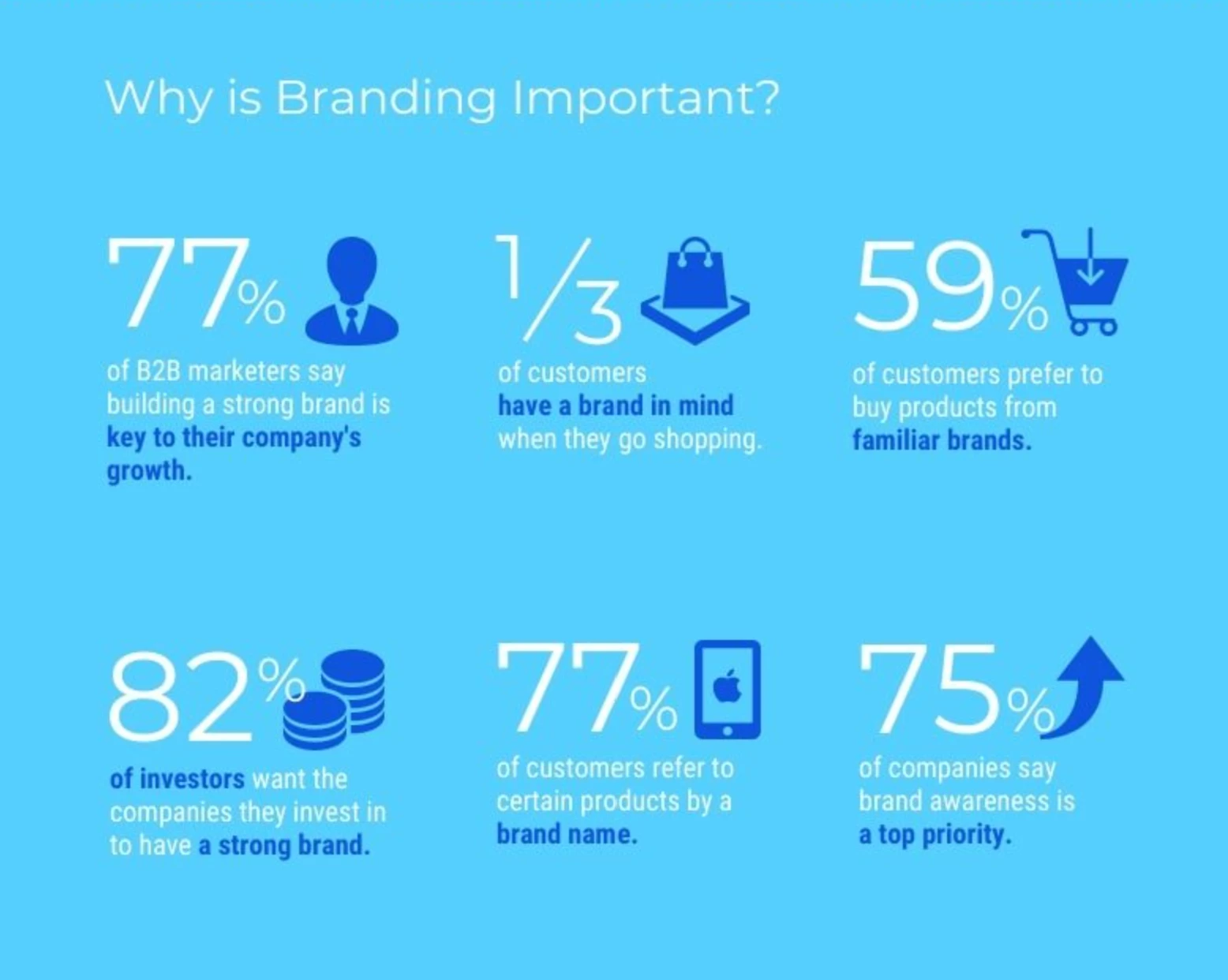
Plus, branding experts agree it typically takes five to seven exposures for a new logo to register in the public mind.
But the proliferation of the memes hijacked those critical exposures as audiences saw parodies instead of the actual logo itself, undermining true brand recognition.
When Good Design Meets Bad Timing
The intent behind the new logo’s design was to root Airbnb in people and community, rather than placing a focus on the platform itself, as most tech companies do.
The Bélo was supposed to feel personal, fluid, and infinitely adaptable.
In fact, Airbnb even added a new section on their website, “Create Airbnb,” that allowed hosts to personalize the new logo for use in thank-you cards and other merchandise for their guests.
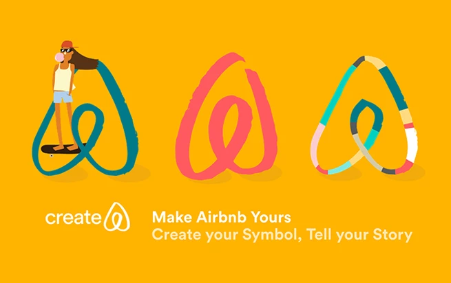
To be fair, it’s easy to see the inspiration in the various elements of the logo. And I do believe that the logo does capture the values it's meant to represent quite well.
But only because I’ve read the explanation behind the design choice.
I can only speculate that, in the social media landscape of the mid-2010s, most people were exposed to the new logo first and immediately reacted, skipping the explanation altogether.
And then came the memes.
It’s no secret that memes are the Internet’s shorthand for collective interpretation, and they move faster than any focus group.
A single rounded shape became the canvas for every kind of riff — bathroom humor, snack mash‑ups, even critiques of corporate branding.
Perhaps there’s something in the water: @Airbnb@n3tworkcopic.twitter.com/0ql3gWmyLn
— Prof. Erik Spiekermann (@espiekermann) July 17, 2014
It was an absolute nightmare for anyone in the branding industry, but it also illustrated a deeper truth that Airbnb had to learn the hard way:
You can’t control what other people see, only what you intend for them to see.
Airbnb had no choice but to go into damage control mode, releasing explanatory videos and social media posts, in an attempt to reclaim the narrative.
Yet every attempt to steer the conversation only gave new fuel to the parodies and criticism.
Why This Still Matters in 2025
Fortunately, the Bélo was able to survive its rocky debut and is still Airbnb’s logo today. But it serves as a cautionary tale for brands and agencies everywhere.
Given how 55% of brand first impressions are visual, as published on Exploding Topics, it's vital that brands make that any new logo or visual is perceived as intended.
A logo is not a static piece of branding collateral but the opening handshake in a media environment of group chats, TikToks, and comment threads.
That was the case in 2014, and it still rings true today.
View this post on Instagram
Airbnb’s experience sparked a reset in identity design, giving rise to practices that are essential.
That said, brands and agencies with rebranding plans in the near future should:
1. Broaden the feedback loop
Design reviews should extend beyond the boardroom to include online communities like urban trendsetters, suburban families, niche hobbyists, and more. Diverse perception panels catch hidden associations before they go viral for the wrong reasons.
2. Prototype the parody
Why wait for meme merchants to parody your logo? Before committing to a final design, teams will want to intentionally sketch their own worst‑case memes. Be overly critical as you dissect your assets and materials. If the spoof writes itself, the mark isn’t ready.
3. Stress‑test for every screen
A logo does not live in isolation. It needs to sing on a billboard, a 20‑second ad spot, and the tiny corner of a smartphone screen. Agencies should embed live‑context previews into their workflow to see how a design holds up. If a design falters in any of these environments, it goes back to the drawing board.
4. Continuously analyze cultural context
A logo lives long after launch, and cultural currents shift daily. Smart teams keep an ear to the ground — tracking trending hashtags, monitoring niche forums, and scanning emerging visual trends. If an unexpected interpretation gains traction, small adjustments (a curve here, a stroke there) can nudge the design back on course.
Design for the Dialogue, Not Just the Deck
I remember when the Bélo was launched. I was just starting out in my marketing career. Like most people, I laughed at the memes and wondered how no one at Airbnb or their agency saw this coming.
Of course, hindsight is 20:20. But it definitely highlights the importance of anticipation from a branding perspective.
Because in today’s social media-savvy world, new logos don’t get a quiet rollout. They get instant, emotional, and public reactions.
That’s why modern brand identity is as much about cultural preparedness as it is about creative direction.
And in an Internet age filled with jesters waiting to pounce at the next brand misstep, a logo shouldn’t be seen as the last step of a rebrand.
It’s the first sentence in a public dialogue.
The best logos don’t just look good. They communicate a message no one would misinterpret. These design teams build identities that speak with clarity, purpose, and staying power:


