UX to Improve B2B Conversions: Key Points
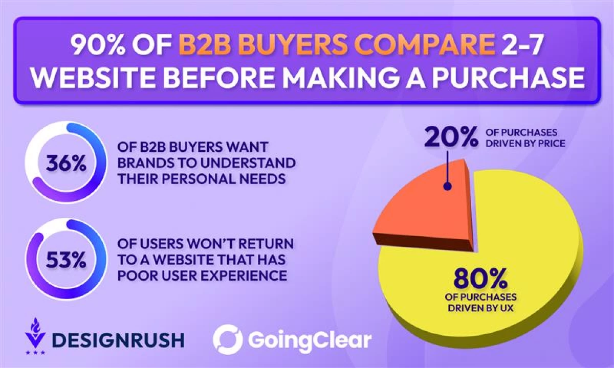
- 90% of B2B buyers will compare anywhere from 2 to 7 different sites before making a purchasing decision for their organization.
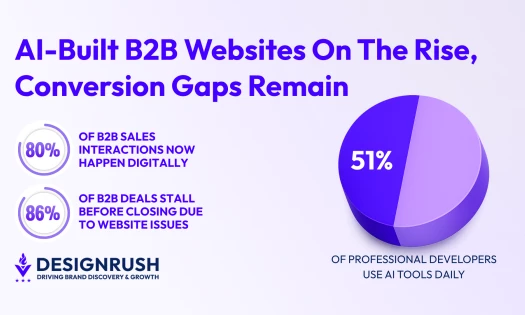
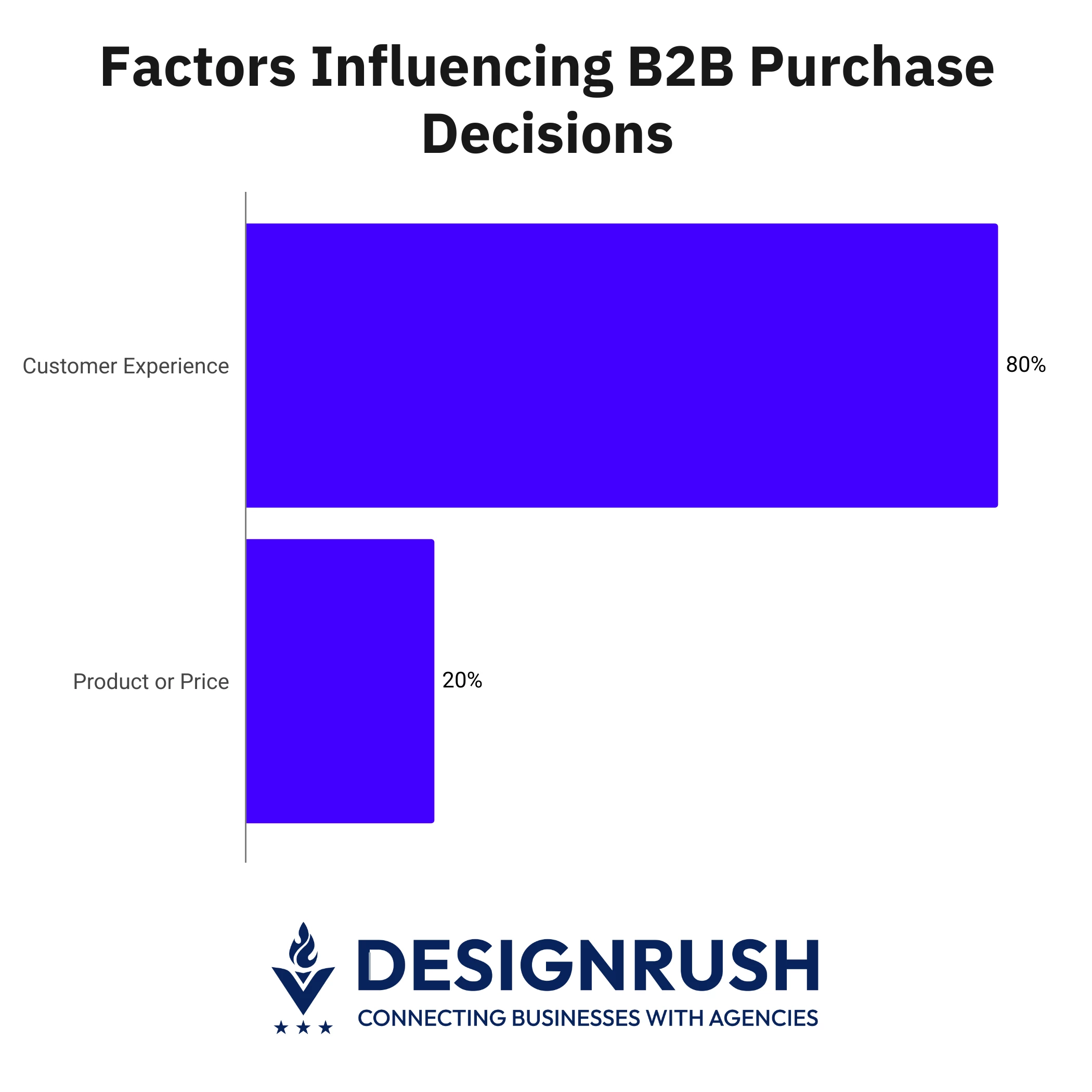
- 80% of B2B purchases are driven by UX, while only 20% of purchases are influenced by price or the product itself.
- Continuous UX testing through A/B tests, heatmaps, and form analytics turns websites into living systems that adapt faster than competitors.
According to statistics from DesignRush, 90% of B2B buyers will compare sites before making a purchasing decision.
To be more specific, they will research anywhere from 2 to 7 different B2B websites before buying a product.
This habit may seem obvious since brands now have overflowing digital options, but it has serious implications.
Comparison shopping doesn’t just pit prices and features against one another.
In fact, 80% of B2B purchases are driven by UX, while the product itself and price account for only 20% of decisions.
Editor's Note: This is a sponsored article created in partnership with Goji Labs.
All these point to the fact that B2B buyers now consider competence, reliability, and clarity far more than before, shifting the stage where brands compete.
As such, a site that stumbles on any of these fronts can lose a deal before the first sales call is even booked.
Agencies like Boston-based GoingClear, which focus on digital strategy and UX, have noted how often companies underestimate this dynamic.
“Too often, brands still assume that a site’s job is to inform and sell. Today, however, its true role is to persuade under scrutiny and with buyers having competing options open on their browsers.
In many cases, the better-designed site wins the meeting, especially if the products are “equal,” because it signaled credibility faster,” said Paul J. Scott, chief website strategist at GoingClear.
Design with Clarity and Visual Appeal
The best websites are less about looking impressive and more about moving people efficiently from their question to the answer.
Unfortunately, clarity and flow take a backseat in the pursuit of visual appeal.
The result is an obstacle course of dropdown menus, jargon-heavy copy, and CTAs buried deeper than a treasure chest.
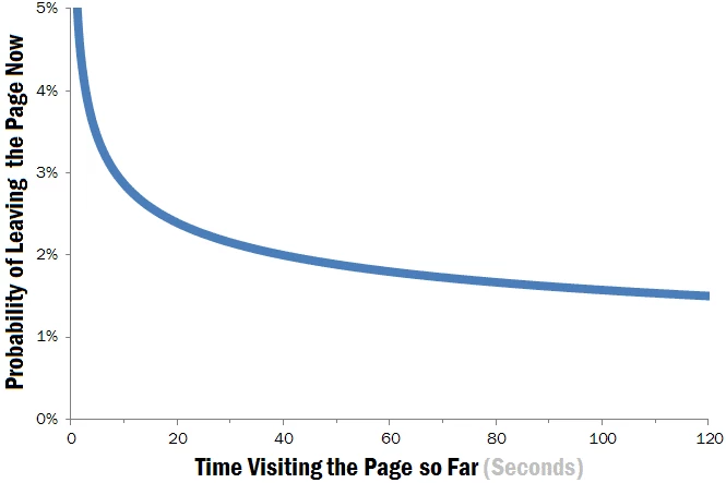
This is a huge problem since a Nielsen Norman Group study showed that the probability of a user leaving a website is highest within the first 10 seconds.
However, the more time is spent on a website, the probability of a user leaving drops significantly.
Fortunately, there are a few straightforward strategies businesses can improve the UX of their B2B websites:
- Simplify navigation. Menus should be brief, intuitive, and avoid unnecessary layers. The fewer clicks between landing and understanding, the better.
- Prioritize scannable content. Long walls of text slow decision-making. Use short paragraphs and bullet points to help busy professionals size up an offering quickly.
- Keep layouts consistent. Familiarity and predictable patterns reduce cognitive load. Keeping things consistent makes everything easier to find.
- Highlight CTAs where decisions happen. Calls to action should appear at natural decision points, not hidden in footers.
- Speed up performance. Not all UX improvements impact visuals. Buyers comparing vendors will leave slow sites behind, no matter how good the content looks.
Optimize Conversions with UX Tests, Not Guesswork
Of course, attracting visitors and keeping them on your B2B website is only the beginning. You still need to convert these visitors before it actually counts as a win.
This goes beyond simply tacking on a form to webpages. B2B leaders need to ask themselves how these forms fit into the buyer’s decision-making process.
For experts like GoingClear, this means using UX testing to get the right data to inform strategies:
- Test CTAs with A/B testing. Subtle differences in wording or placement can shift conversion rates more than elaborate design overhauls. Keep doing so until you find the one that works best.
- Heatmap user behavior. Understanding where visitors pause, scroll, or abandon the page altogether helps teams find and eliminate friction points. These insights often reveal surprising problem areas.
- Check form analytics. Measure which fields users abandon or hesitate to reveal friction in the most critical step of conversion. Use analytics to figure out which fields to simplify, reorder, or remove.
“What separates high-converting teams is how fast they act on the insights these tests derive. That’s why UX data should always be treated as living feedback.
Make adjustments in real time instead of waiting for a redesign cycle. The faster you can respond to the insights you uncover, the harder you make it for competitors to catch up,” explained Scott.
Turn Your Website Into a Living System
B2B competition no longer happens in conference rooms. It happens on screens where buyers click, skim, and move on without a second thought.
That’s why setting up processes to review UX data weekly, aligning design updates with real buyer behavior, and budgeting for iteration are the keys to winning in 2025.
Because, as with most things in business, the gaps are not closed by promises but by experience and performance.
And a B2B website that doesn’t adapt isn’t competing. It’s just waiting to be replaced.