Pantone’s Cloud Dancer: Key Findings
- Pantone positions Cloud Dancer as a unifying hue, driving cross-industry innovation and consumer engagement through thoughtful collaborations.
- Experiential activations from immersive spas to home furnishings extend Pantone’s color story beyond visual design.
- Limited-edition products across tech, lifestyle, and home categories show how the Color of the Year can anchor brand marketing strategy.
Campaign Snapshot
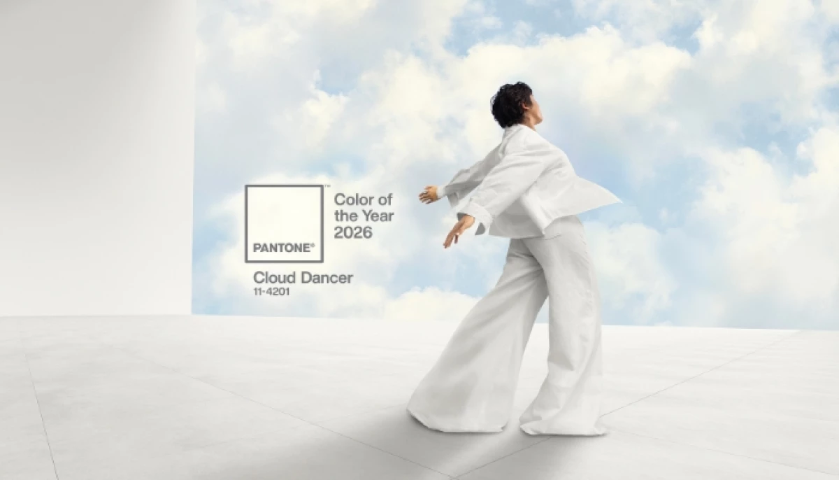
Pantone is turning its 2026 Color of the Year, PANTONE 11-4201 "Cloud Dancer," into a multi-industry experience through a slate of collaborations.
The initiative will translate the airy white hue into products, spaces, and immersive moments, showcasing how Cloud Dancer can be a commercial driver, inspiring creativity, calm, and balance across industries.
View this post on Instagram
“At this time of transformation, when we are reimagining our future and our place in the world, PANTONE 11-4201 Cloud Dancer is a discrete white hue offering a promise of clarity,” said Leatrice Eiseman, executive director of the Pantone Color Institute.
Meanwhile, VP Laurie Pressman added that the color "exemplifies our search for balance between our digital future and our primal need for human connection."
"It's a liminal space that is a launchpad for creative expression — as individuals and communities are experimenting beyond traditional boundaries, opening the door to increased imagination and innovation," she added.
All of these strengthen the potential of collaborative opportunities, fostering a cohesive consumer journey for both Pantone and its partnering brands.
What Fans and Consumers Will See
As part of its multi-year partnership, Motorola is launching a Cloud Dancer edition of the "Motorola Edge 70," combining the hue with quilted vegan leather and Swarovski crystal detailing to highlight the premiumness of the design.
Meanwhile, Pura will extend the color into fragrance, aiming to capture the airy, calming character of Cloud Dancer.
Mandarin Oriental will also bring the shade to life through spa treatments, afternoon teas, and immersive guest experiences.
When it comes to home furnishings, Joybird is rolling out Cloud Dancer across more than 300 furniture silhouettes, using fabrics to push wellness and slow-living themes.
View this post on Instagram
Play-Doh, celebrating its 70th anniversary, introduces a Cloud Dancer version of its iconic modelling compound, establishing the color as a blank canvas for mindful creativity.
And lastly, the Post-it brand highlights the hue in its new "Neutrality Collection," and Command Brand’s limited-edition "Cream Speckled" range emphasizes flexibility and personal expression in home organisation.
What We Can Learn from Pantone’s Multi-Brand Strategy
Pantone provides a blueprint for turning a visual concept into a multi-category ecosystem.
- Color can act as a unifying narrative, translating abstract concepts into tangible products and experiences.
- Experiential activations, from hospitality to home furnishings, help deepen emotional connection to a campaign.
- Cross-category initiatives amplify visibility and authentically tell a brand's story when executed with consistent messaging.
Other brands like Sherwin-Williams and Benjamin Moore have similarly used their color launches to bring consumer engagement beyond product sales.
View this post on Instagram
It's a sign of the commercial weight that color-based campaigns have across industries.
Our Take: Can Color Drive Emotional Connection?
We think Cloud Dancer works because it operates before explanation.
Color sets tone and expectation faster than language ever can, and Pantone understands that instinctively.
That said, we are also cautious. Not every brand can turn a single hue into a meaningful experience.
When color is treated as a shortcut rather than a system, it risks becoming surface-level decoration instead of an emotional signal.
We believe Pantone succeeds here because Cloud Dancer is not positioned as a one-off trend.
It is treated as a shared framework that brands can interpret across products, spaces, and moments without losing coherence.
Still, the execution matters more than the idea. Color only becomes powerful when it is applied consistently and with restraint.
Forced activations or mismatched partnerships would quickly dilute its impact.
In other news, Crayola is exploring a collaboration with McDonald’s, pushing the boundaries of creativity through collectible consumer experiences.
Partner with the Top Digital Agencies to elevate your brand’s online presence and strategy through DesignRush.