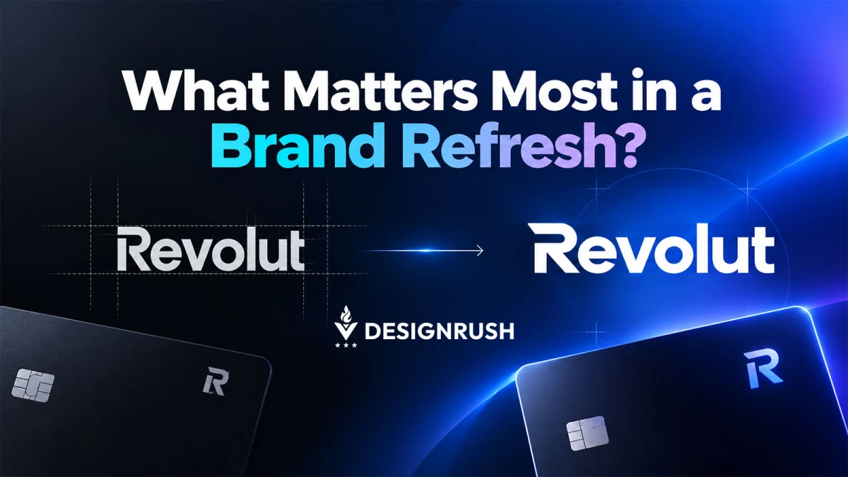

Refreshing a brand that millions of people already recognize is very different from creating one from scratch.
The challenge is not simply to make it look newer.
It’s about deciding which parts of the identity have earned the right to stay, which ones are holding the brand back, and how far the design can evolve before familiarity starts to disappear.
That was the question behind our independent Revolut concept at IT Monks.
We wanted to explore how we would approach the visual identity of a fast-moving fintech brand where speed, innovation, and trust all need to coexist.
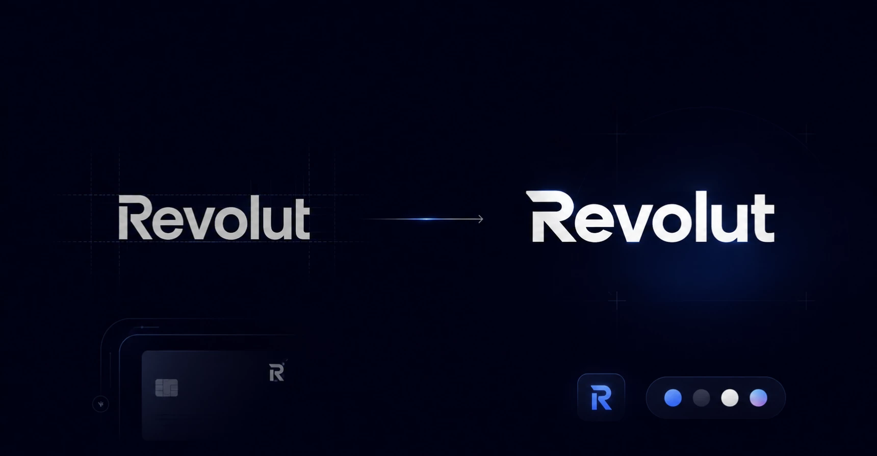
What interested us most was not creating something dramatically different. We worked through the decisions a real refresh at that scale would demand.
So we really had to dive deep into what to preserve, where to introduce more energy, and how choices around logo, color, typography, and brand applications could support the same idea rather than compete with one another.
We Started With the Brand Tension, Not the Logo
It is tempting to begin a refresh by opening a design file and experimenting with logos. We approached the Revolut concept from the opposite direction.
The first question was what the identity needed to communicate.
For us, two ideas stood out: movement and confidence.
- Movement matters because Revolut has built much of its recognition around a different relationship with financial services. The experience is digital, immediate, and designed around actions that happen quickly. A visual identity for a company like that cannot feel static or overly institutional.
- Confidence matters for the opposite reason. Finance still involves people's money. However progressive the product may feel, the brand cannot become so experimental that it stops communicating stability.
That tension became the foundation of the concept.
We were not trying to make a financial company look more exciting in isolation. We were trying to create enough visual energy to suggest speed while maintaining enough structure to feel dependable.
Once that principle was clear, decisions about individual elements became easier to evaluate.
If something looked dynamic but reduced credibility, it did not solve the problem. If something looked trustworthy but could have belonged to almost any traditional financial institution, it did not solve the problem either.
That is the way we tend to approach corporate design work at IT Monks. Before discussing individual components, we identify the tension the visual system needs to resolve.
A Recognizable Brand Gives You Less Freedom, Not More
One of the most useful parts of the Revolut concept was thinking about existing brand equity.
When a company is unknown, designers have considerable freedom. There is little visual familiarity to protect.
With an established brand, the situation changes. Recognition itself becomes an asset.
That is why we did not approach the concept as an opportunity to replace everything associated with Revolut.
The more recognizable a company becomes, the more we believe a refresh should distinguish between elements that genuinely limit the identity and elements that simply feel familiar because people have seen them for years.
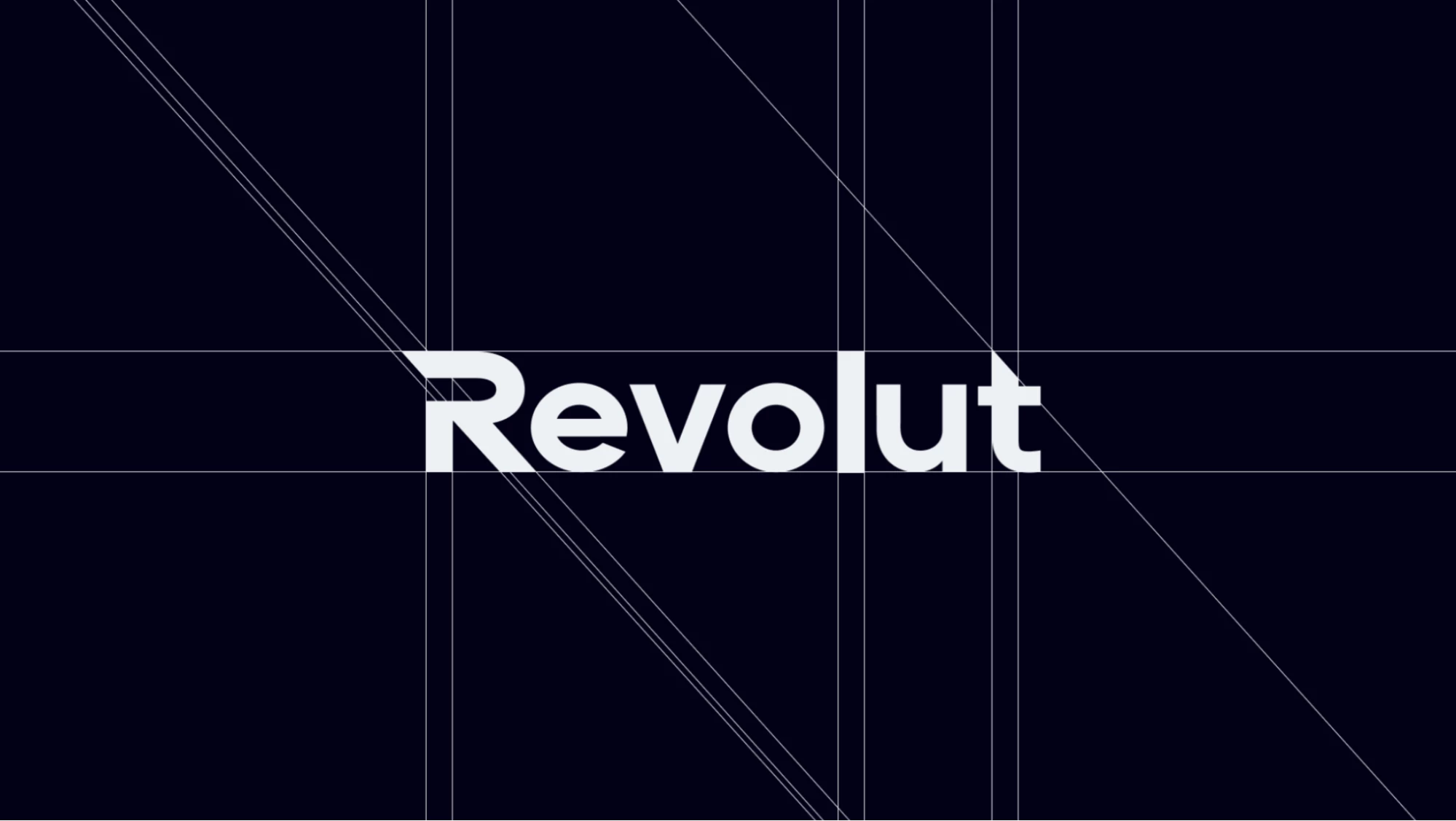
Our goal was therefore evolution rather than visual reinvention, so the logo was considered in that context.
Instead of asking how radically different we could make it, we looked at how its visual behavior could better communicate momentum while remaining clear and recognizable across the places where a fintech brand actually appears.
That includes much more than a large logo on a presentation slide. The identity has to survive app interfaces, advertising, social media, small digital placements, campaign graphics, and potentially physical applications.
A logo can look impressive at 800 pixels wide and still fail as part of a corporate identity.
For the concept, scalability and clarity were therefore as important as personality.
Translating Speed Into a Visual System
"Make the brand feel faster" sounds useful until someone has to turn it into actual design.
Speed cannot simply be written into a creative brief. It has to become visible through decisions about proportion, composition, spacing, typography, and the relationship between elements.
For the Revolut concept, we treated movement as something that should exist throughout the system rather than as one decorative effect.

The thinking behind the logo, for example, was connected to the broader visual rhythm.
Shapes needed to feel deliberate rather than heavy. Layouts needed to leave room for strong hierarchy.
Marketing assets needed enough flexibility to create energetic compositions without making every application look unrelated to the next.
This is an important distinction in how we approach identity work.
A concept such as "speed" should not produce a collection of obvious symbols of speed. Adding arrows, motion lines, or aggressive angles everywhere would be literal, and it would age quickly.
Instead, we try to translate the idea into the behavior of the design.
- How quickly can someone understand the hierarchy?\
- Does the typography feel contemporary without becoming difficult to read?
- Can layouts feel active while still giving financial information enough breathing room?
- Can the same identity support a bold campaign and a much more restrained product communication?
Those questions shaped the Revolut concept far more than any single visual motif.
Color Had to Carry Trust and Energy at the Same Time
Color presented a similar problem.
For a financial brand, the identity needs enough stability to feel credible, but for a company associated with speed and innovation, playing it too safe can make the visual language feel conventional.
In our Revolut concept, we translated that balance into the palette itself.
- Ruddy Blue and Rich Black became the primary colors, giving the system a strong, controlled base while still feeling distinctly digital and contemporary.
- Light Coral introduced a warmer, more energetic counterpoint.
- Cadet Grey and Anti-Flash White gave us quieter neutral surfaces for layouts where clarity needed to take priority.
That combination is visible across the concept applications.
The blue and coral can come forward in more expressive campaign graphics and card imagery, while black, white, and grey give more restrained communications enough breathing room.
The result is not one fixed visual intensity, but a palette that can shift depending on what the brand needs to say while still feeling like part of the same identity.
That was important to the wider concept.
A promotional campaign and an information-heavy financial screen should clearly belong to the same brand, but they do not need to communicate with exactly the same level of energy.
Building both expressive and neutral colors into the system gave us that range from the start.
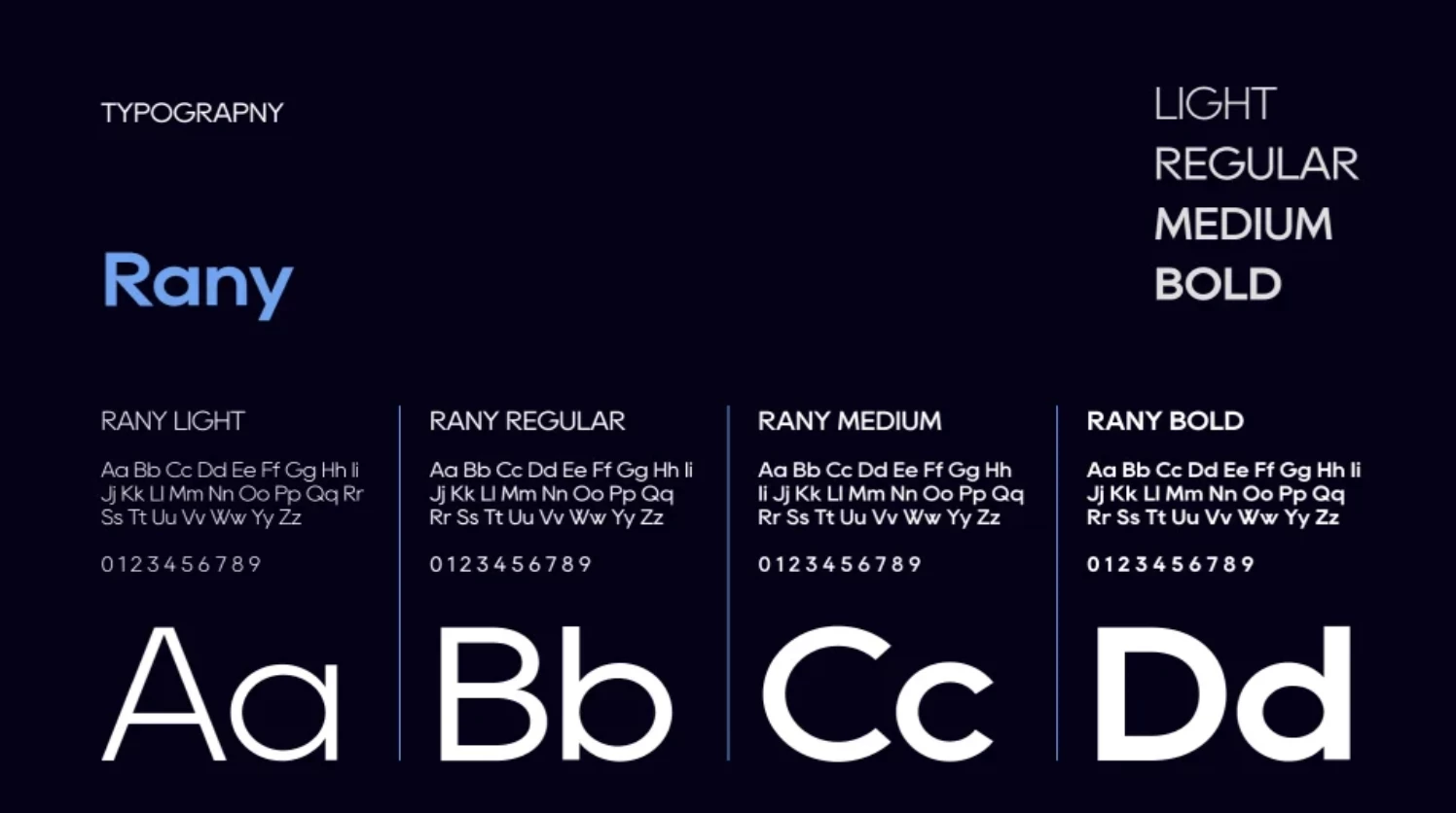
Typography Was About Pace, but Also About Utility
For a company such as Revolut, typography has a practical job. It appears around numbers, product features, interface elements, campaign messages, explanations, and financial terminology.
Given this, a distinctive typeface that becomes tiring or unclear in those environments would create more problems than it solves.
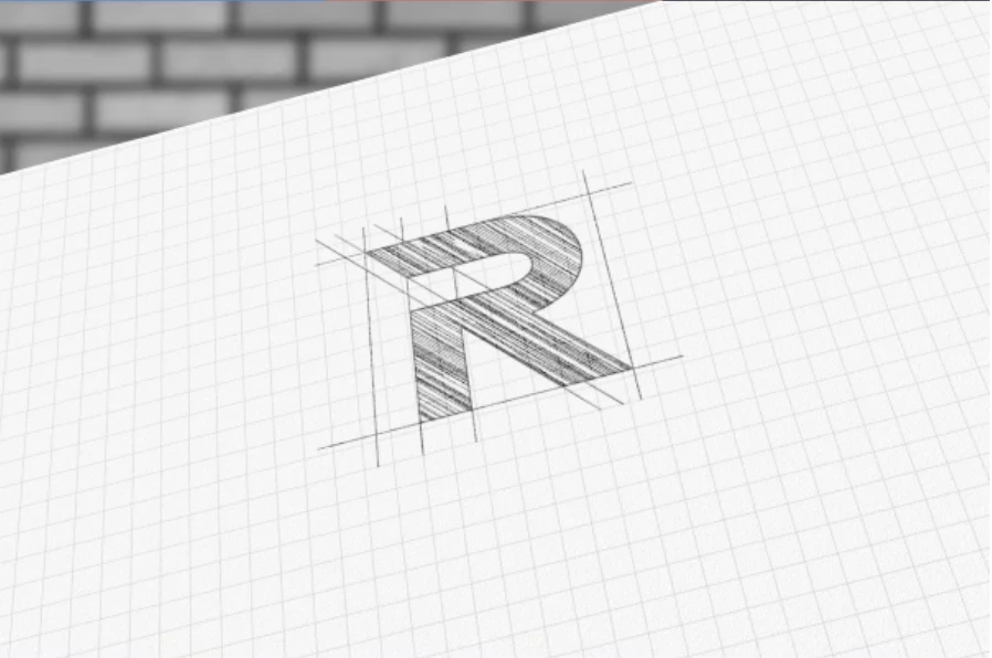
Our thinking therefore centered on two requirements.
The typography needed enough character to support the more progressive side of the concept, but its structure still had to support fast reading and clear hierarchy.
That meant thinking beyond the typeface itself.
Weight combinations, scale, line length, spacing, and the relationship between headlines and functional copy all influence how a brand feels.
The sense of speed we were looking for could partly come from stronger hierarchy and more confident use of scale rather than from selecting an unusually stylized font.
This is a recurring consideration in our design process. Corporate identities eventually become working systems, so visual personality cannot come at the expense of everyday usability.
The Identity Had to Work Beyond the Brand Presentation
One reason we extended the Revolut concept into more than 20 screens and over 10 brand assets was to test whether the thinking could survive outside an isolated logo treatment.
That matters because a brand refresh does not really exist in the logo file.
It exists in the hundreds of decisions made afterwards.
- What happens when marketing launches a campaign?
- How does a designer introduce a new product without inventing a completely new visual language?
- How much freedom should social assets have?
- What stays fixed when layouts change?
Testing an identity across multiple applications exposes inconsistencies very quickly.
Something that feels convincing in a single composition may become repetitive after ten applications.
A visual device may be too restrictive. A palette may not have enough range. A typography system may struggle once longer content is introduced.
Building the wider concept allowed us to challenge those choices rather than treating the first successful composition as proof that the system worked.
Guidelines Should Explain Decisions, Not Just Police Them
The final part of our thinking was consistency.
For a large organization, a new identity will eventually be used by people who were not part of the original design process.
As such, internal teams, agencies, performance marketers, product designers, event teams, and external partners may all interpret the same system.
That makes guidelines more than a document listing logo dimensions and color codes.
The most useful guidelines explain the logic behind the identity.
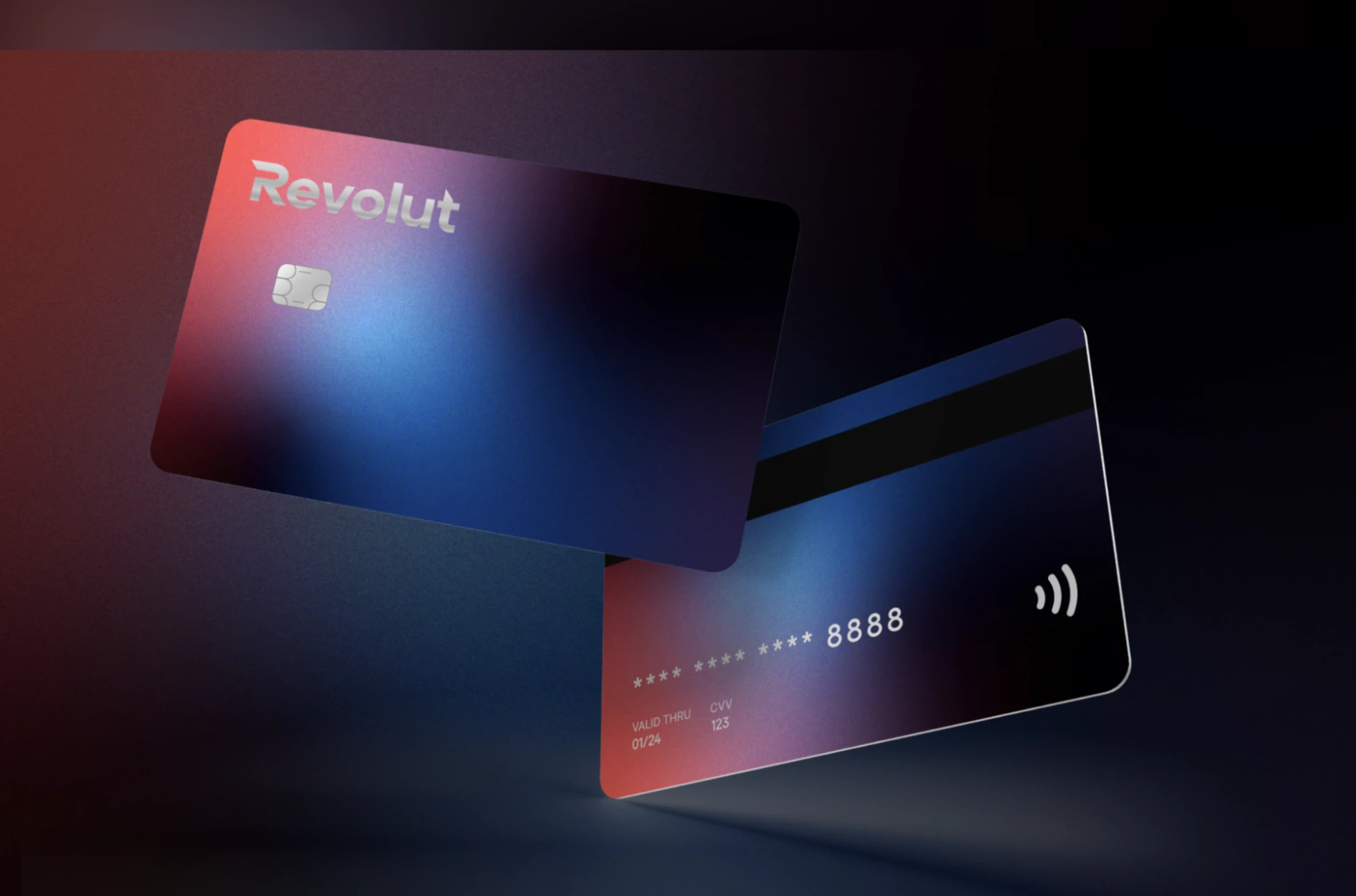
For the Revolut concept, that would mean documenting not only which elements can be used, but how the balance between movement and trust should appear in practice.
Which parts of the system are fixed? Where can designers introduce more energy? What happens when a communication needs to feel serious rather than promotional?
Rules are easier to apply when people understand why they exist.
We see that as particularly important for fast-moving companies.
The goal of a brand system should be to give them enough structure to move quickly without gradually fragmenting the identity.
What the Revolut Concept Taught Us About Corporate Refreshes
Our Revolut concept was never about proposing that an established company should discard everything it already had.
The more interesting challenge was restraint.
We had to decide which signals could be pushed harder, where familiarity had value, how speed could become a design behavior rather than a slogan, and how trust could remain present without pulling the identity back toward traditional banking conventions.
That is also how we tend to think about design for larger organizations at IT Monks.
We do not begin with the assumption that modernization means replacing more things.
We begin by understanding what already carries meaning, what has stopped doing its job, and what the next version of the system needs to handle that the current one cannot.
The Revolut concept gave us a way to explore those decisions without the constraints or claims of a commissioned engagement. It is our creative point of view on what a refresh for a company at that level might require.
And if there is one conclusion we took from the process, it is that the hardest part of refreshing a recognizable brand is not deciding what new elements to introduce.
It is knowing what is already valuable enough to leave alone.